3PL Central’s Organic Traffic Skyrockets 45% with User-Centric Website Redesign
3PL Central has a simple solution to warehouse problems. They provide easy-to-use, cloud-based warehouse management software (WMS) for third-party logistics companies (3PLs) and warehouses of all kinds. By providing three different software solutions built to manage the complex administration of warehouses in different industries, 3PL Central has tapped a niche market full of potential.
The Challenge:
While 3PL Central has always offered a top-of-the-line product, the website was not always so user-friendly. 3PL Central’s target customers are data-driven people who are uninterested in fluffy content and do not have the time or patience to navigate through a messy website. 3PL Central needed to streamline their site to attract and maintain target customers.
Before the redesign, the website:
- Had grown outdated and slow
- Did not offer a clear message or value proposition
- Was busy and too much for the eye to take in
- Was unresponsive
The biggest problem of all? The website was not mobile friendly. In this day and age, that’s digital suicide.
3PL Central knew that a website redesign was critical to its overall company health, prosperity, and growth. In order to obtain more leads and turn them into customers, 3PL Central’s site needed to engage and provide value to warehouse managers, sales reps, and data analysts looking to control the chaos of logistics management.
When looking at 3PL Central’s website, SmartAcre® observed a cluster of overlapping images and competing content. It was hard to distinguish what visitors were looking at, as nothing was laid out according to the buyer’s true journey. A clear navigation path and CTA for customers was not apparent, and data showed that the content was not resonating fast enough for visitors to stay on the page.
SmartAcre then took a peek into what the back end of the website showed, and that was just as messy. Created by a third party, it was hard to understand, and visitors could not find crucial information within the navigation or other parts of the website. Since 3PL Central’s goal was to provide a seamless user experience for target customers visiting the website, a clean, easy-to-use content management system (CMS) was crucial. SmartAcre and 3PL Central wanted to increase the visitor-to-lead creation, and cleaning up the backend of the website was the first step in this process.
The Design Process:
Before beginning a full redesign, SmartAcre led 3PL Central through the creation of buyer personas in order to gain an understanding of 3PL Central’s target audience. The team could then fully discern who would see the site and create a custom experience. SmartAcre and 3PL Central needed to know who the prospects were, what they wanted, what drove them to the site, and ultimately, what would make them stay. By categorizing 3PL Central’s target audience into five different personas, SmartAcre was able to begin organizing the website based on what would provide compelling content and value for these personas.
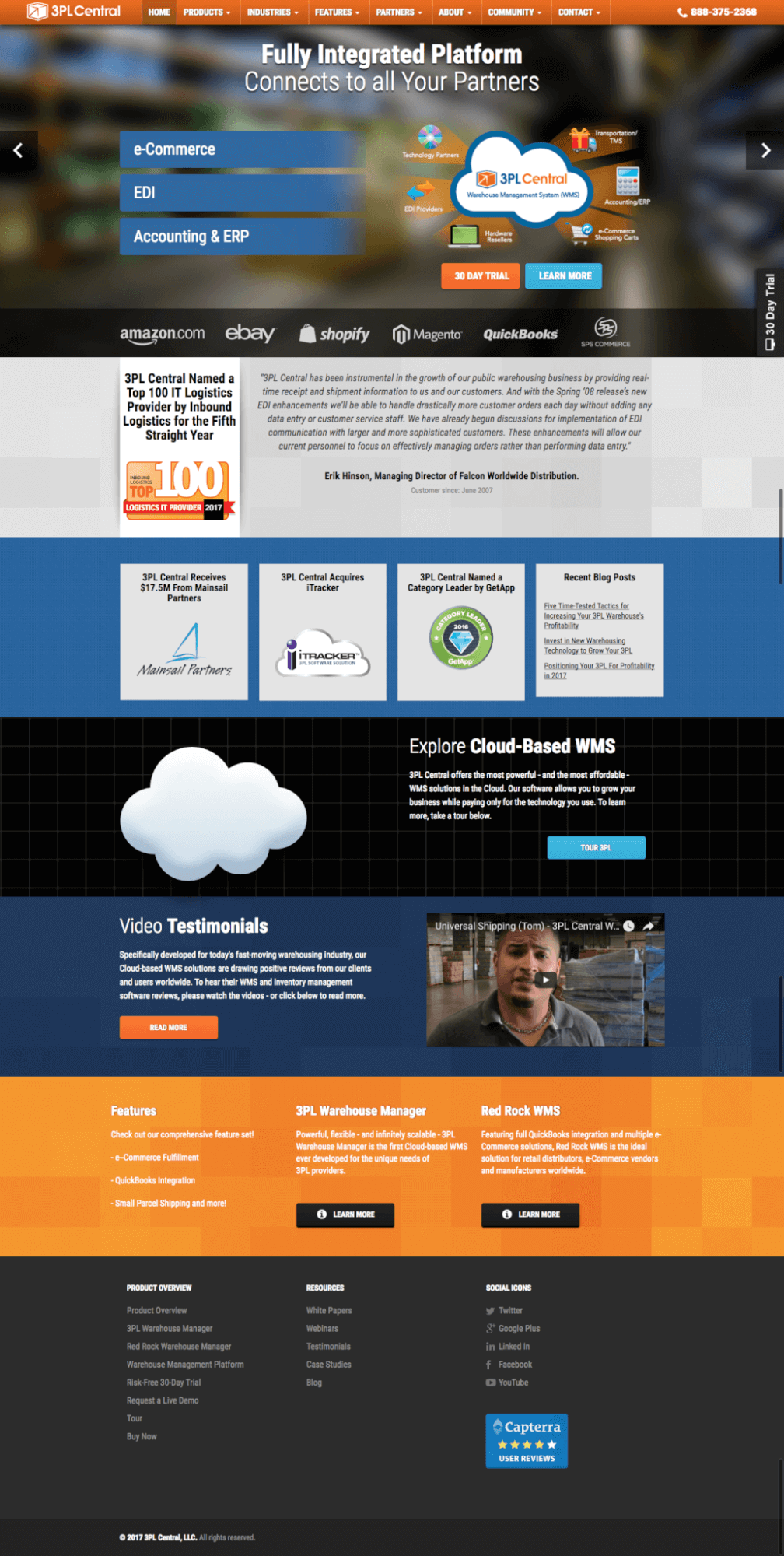
After collaborating with 3PL Central and creating the personas, SmartAcre’s goal was to make the homepage a worthwhile place for potential buyers to land. The team decided to tie the rotating aspot on the homepage with three priority buyer personas. Whether a visitor is an owner, a warehouse worker, or a sales rep, the homepage aspot provides three clear options to customize their experience. Once a visitor identifies himself or herself with the correct persona and clicks the corresponding link, the site takes the visitor to a landing page focused on providing value and content specific to solving the buyer persona’s toughest challenges.
We put the user at the center of the design process, making sure that usability, messaging, and CTAs were built for the target audience.
Old Homepage: New Homepage:
The Results:
The redesign intended to bring 3PL Central in line with industry benchmarks, but instead, it put them one step ahead of competitors, giving 3PL Central an edge. Now, we are seeing 3PL Central’s competitors react to our design and refresh their own sites.
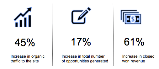
While this redesign occurred just 2 months ago, 3PL Central is already seeing tremendous results. When comparing metrics from May, 15 2016 – July 15, 2016, to metrics from May 15, 2017 – July 15, 2017:
Now that 3PL Central’s website pages are improved, we are expanding their PPC program. Although it is early for definitive results, we are confident that it will greatly increase traffic to the site.
The website redesign energized 3PL Central. They have a cleaner, fresher look, with consistent messaging, making them a unified force not to be reckoned with. 3PL Central is changing the way that WMS for 3PLs and warehouses operate, and we are proud to be an active partner in their growth and success.


