Design & Experience | Brand
Investment Metrics Rebrand
Expertise
Industry
Tactics
Overview
Our primary goal was to revamp and modernize the client’s appearance to set them apart from competitors, while also improving the user experience and driving more qualified leads.
Additionally, we aimed to establish the brand with repeatable assets that could be shared via social media and other engagement channels. This included organizing existing content and developing new creative that accurately reflected the brand. Furthermore, we sought to clearly articulate the value proposition(s) and offerings on their web property. In order to maximize lead generation and nurturing, we created a new brand with a clear path to conversion.
Challenge
Investment Metrics lacked creative assets and direction and faced an opportunity to develop a strong brand and path forward. They were open to any ideas we had to offer, as long as we maintained their blue as part of their core branding. Ultimately, Investment Metrcis’ goal was to embody a modern feel in the new brand elements. We aimed to exceed our client’s expectations and impress them by pushing our creative boundaries.
In addition to the branding revamp, Investment Metrics desired updated messaging that would allow them to remain competitive and distinguish themselves in their target markets. This was especially critical for the website which was uncompetitive due to outdated messaging that no longer aligned with their business model and a disjointed customer experience that hindered information retrieval.
Approach
Brand Strategy
We started the project with discovery into how the new brand should communicate that competitive aspect, both in visual and verbal identity. Our discovery led to a strategy of developing visuals that evoked chart movement of energy and a brand voice and tone that created a unifying, collaborative energy.
Logo
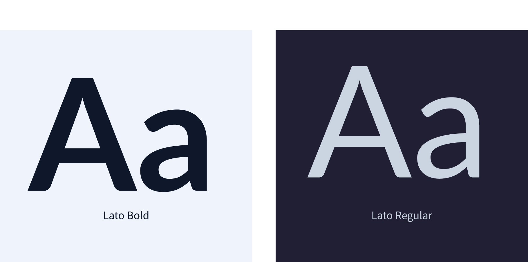
Investment Metrics’ logotype, a modified font built with readability in mind, utilizes the Lato Font Family. The horizontal logo is Investment Metric’s primary logo. The icon correlates the “I” and the “M” and is visualized in a stock or chart representation.
Product Logos
Once the logo was developed, Investment Metrics’ sub-brands required a variation that still kept the main logo intact. We placed a font treatment in the core blue color under the main logo to distinguish the sub-brands and keep the branding aligned.
Visual Language
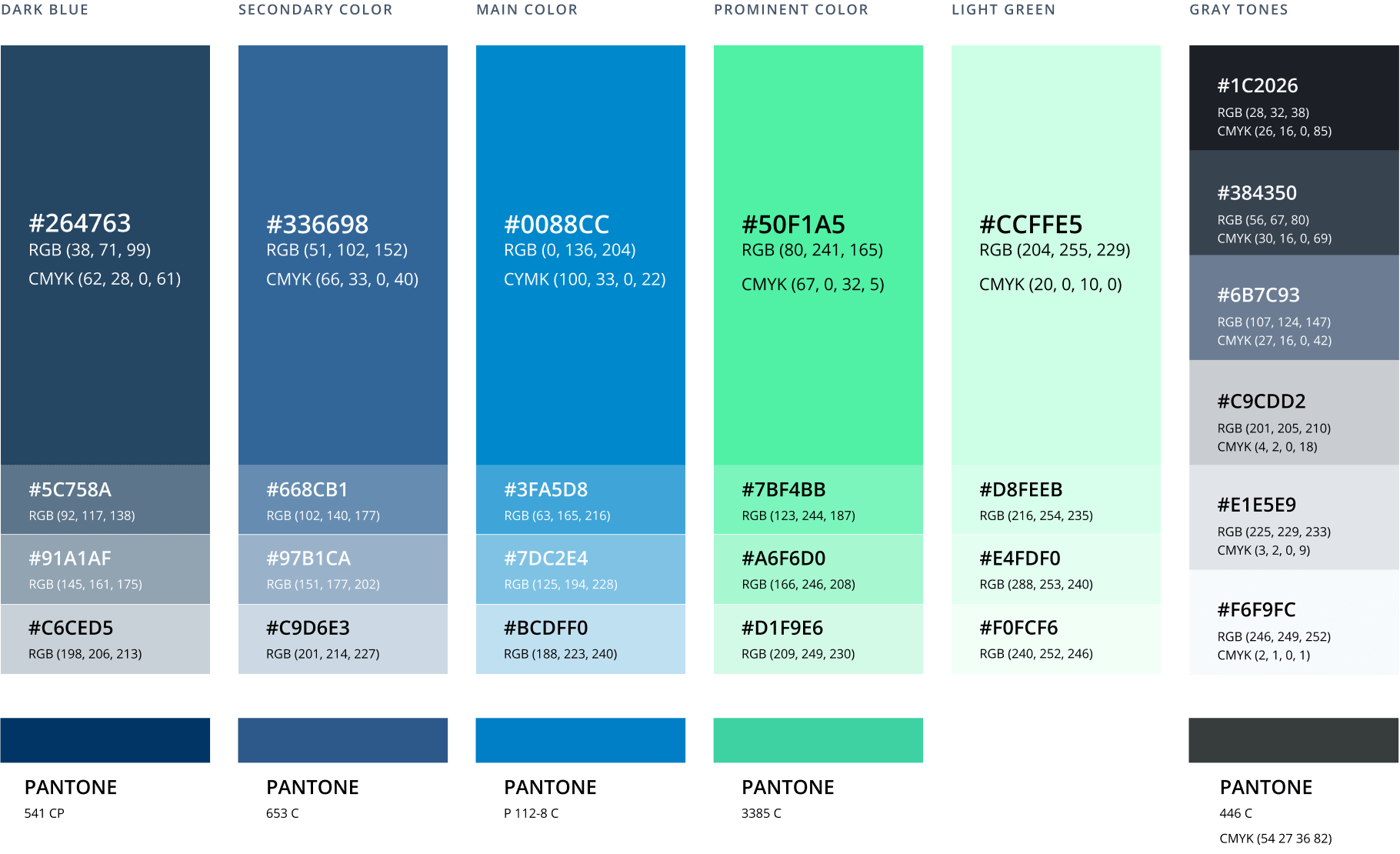
Visual language created by vibrant, bold colors engages the viewer and leaves a lasting impression. With its dynamic energy, contemporary vibe, and vivid feel, it appeals to those who crave excitement and stimulation. The color palette consists of blues and greens that convey growth, loyalty, and respect.
Typography
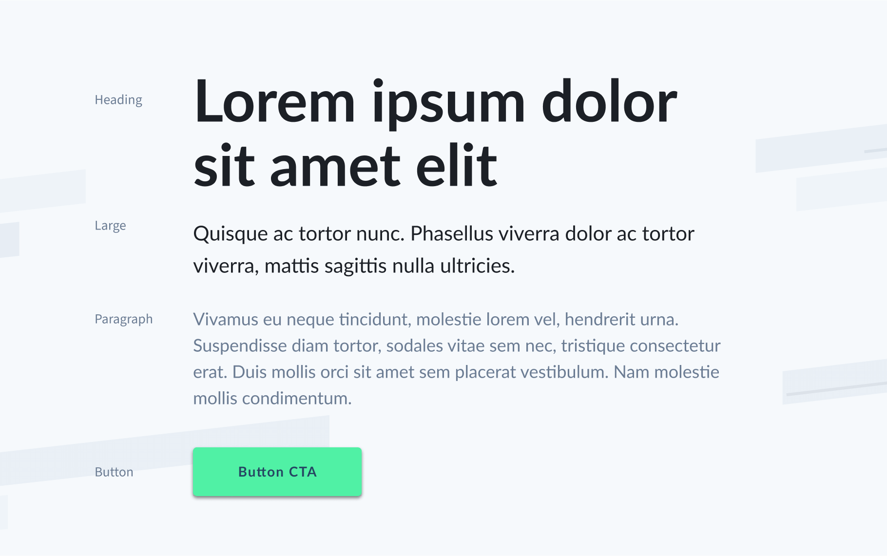
Like the logo, the primary typeface for Investment Metrics is the Lato font family. Investment Metrics uses this bold and clean typeface for headings, displays, and body content.
Interactive
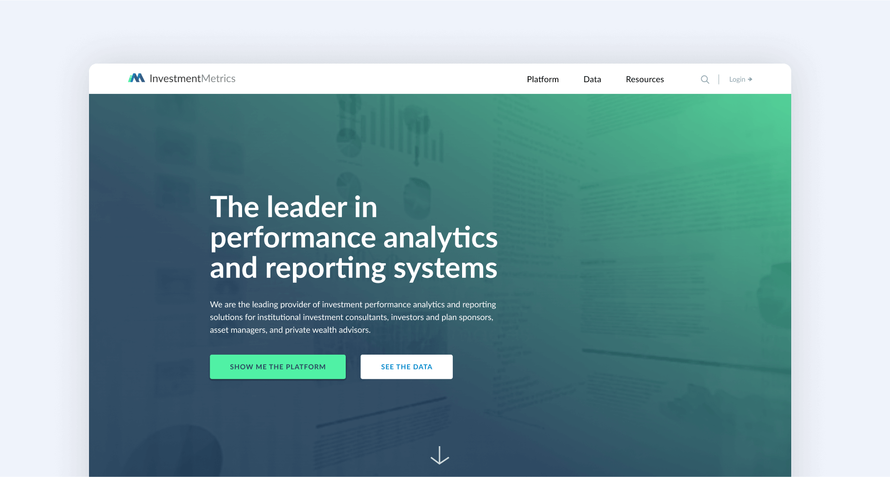
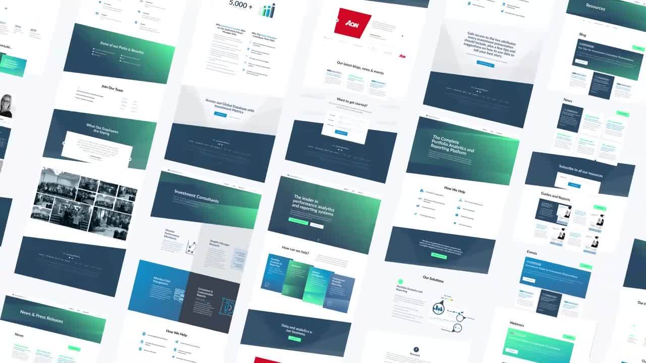
A leading driver behind this rebrand was the website redesign. Coinciding with the rebrand, the website design focused on improving design, messaging, user experience, technology, and depicting a more accurate representation of the brand across mobile and desktop.
Meanwhile, the rebrand focused on updating the inconsistent, outdated messaging to be more in line with IM’s business model, creating a better customer experience, and making it easier to find information.
Outcomes
4250%
Increase in web leads within first 6 months
6Weeks
To launch the new website
196%
Increase in new users
SmartAcre accelerated the website redesign process to hit specific due dates set internally by Investment Metrics in order to hit a launch date in the new year. Within almost two months, SmartAcre was able to provide the following for Investment Metrics, which aided in current and future lead and demand generation initiatives:
- There is now a clear value prop and messaging aligned to who the client helps and their differentiators. Examples include concise and simplified navigation, as well as an updated homepage Aspot.
- Due to how the content is presented, both pageviews and new users on the website increased, allowing leads to get the information they need to make an informed decision.
- The mobile-friendly update, as well as general optimizations, led to a significant increase in page speeds. For example, the homepage went from a score of 1 to 69 according to Google’s PageSpeed Insights.
- According to Moz, crawl errors dropped from 325 prior to the launch to 41 as of June 27, 2019.
Post-Project Success
By using a data-driven strategy to update Investment Metrics’ brand and improve customer experience, SmartAcre was able to move the needle on both lead generation and website traffic. With insights into how their prospects are using their website and interacting with their brand, Investment Metrics is able to leverage that data to make informed decisions on how to move their prospects through the funnel.
Related Case Studies
SmartAcre Rebrand
Our proven methodology is designed to include marketing best practices, user experience, online visibility, and smart development.
Redsson Rebrand
Our primary objective was to simplify and rebrand Redsson's identity and streamline what they offer their clients.
Where We Start
Book a strategy session and we will discuss your unique challenges. For free. Maybe one day you will have a success story to add to this page.

